CRISP-DM
Cross-industry standard process for data mining
- CRISP-DM이란, 데이터로부터 의미를 도출해내는 일반적인 접근법이자 표준 절차다.
- 분야/산업군을 막론하고 가장 널리 사용되고 있는 분석 모델이라고 볼 수 있다.
- 해당 모델에서는, 데이터 마이닝 프로세스를 총 6가지 단계로 나누어 분석한다.
1) Business Understanding:대상분야 이해단계 (비즈니스 로직 이해, 도메인 이해)
2) Data Understanding: 데이터 이해단계 (가용 데이터 품질, 형태, 정보 등 확인)
3) Data Exploration: 데이터 탐색단계 (그래프 그리는 단계)
4) Data Preparation: 데이터 준비단계, 학습(데이터에 들어 있는 패턴을 파악하는 것)
5) Model Planning: 분석 모형 기획 (알보리즘 후보군 선정)
6) Model Building: 분석 모형 수립, 평가지표 적용(채점)
7) Evaluation (평가): Communicate Results (결과 토의)
8) Deployment (모델 전개), Operationalize (사내 시스템 적용) - 각 절차를 살펴보기 위해 미국 공공자전거 이용량 데이터를 CRISP-DM 모델에 적용하여 해석해 볼 것이다.
Data Understanding
해당 데이터는 Maryland 의 Washington D.C 공유자전거 스타트업에서 수집한 것이다.
- 2011 ~ 2012년도까지 2년치, 시간대별(1시간 간격) - granularity
- 날짜정보(datetime, season, holiday, workingday)
- 기상정보(weather, temp, atemp, humidity, windspeed)
- 고객 이용정보(casual, registered, count)
- 날짜
- datetime : 년-월-일 시:분:초
- season : 계절정보
- holiday : 휴일정보
- workingday : 근로정보
- 기상
- weather : 날씨가 험악한 정도
- temp : 온도
- atemp : 체감온도
- humidity : (상대)습도
- windspeed : 풍속(Km/h)
- 고객
- casual : 비등록회원 이용객 수
- registered : 등록회원 이용객 수
- count : casual + registered 해당시간 총 이용객 수
import pandas as pd # 도구 불러오기
df = pd.read_csv('C:\\Users\\esthe\\train.csv') # 데이터셋 불러오기
print(df.shape) # 규모 파악
df.head().T # 무엇이 들어 있는 지 파악
(10886, 12)| 0 | 1 | 2 | 3 | 4 | |
|---|---|---|---|---|---|
| datetime | 2011-01-01 00:00:00 | 2011-01-01 01:00:00 | 2011-01-01 02:00:00 | 2011-01-01 03:00:00 | 2011-01-01 04:00:00 |
| season | 1 | 1 | 1 | 1 | 1 |
| holiday | 0 | 0 | 0 | 0 | 0 |
| workingday | 0 | 0 | 0 | 0 | 0 |
| weather | 1 | 1 | 1 | 1 | 1 |
| temp | 9.84 | 9.02 | 9.02 | 9.84 | 9.84 |
| atemp | 14.395 | 13.635 | 13.635 | 14.395 | 14.395 |
| humidity | 81 | 80 | 80 | 75 | 75 |
| windspeed | 0 | 0 | 0 | 0 | 0 |
| casual | 3 | 8 | 5 | 3 | 0 |
| registered | 13 | 32 | 27 | 10 | 1 |
| count | 16 | 40 | 32 | 13 | 1 |
계절 별 자전거 이용량은?
import numpy as np
sc = df.groupby('season').agg({'count' : np.mean})
sc| count | |
|---|---|
| season | |
| 1 | 116.343261 |
| 2 | 215.251372 |
| 3 | 234.417124 |
| 4 | 198.988296 |
연월일, 요일 column 생성하기
df['year'] = df['datetime'].apply(lambda x : x.split(' ')[0].split('-')[0])
df['month'] = df['datetime'].apply(lambda x : x.split(' ')[0].split('-')[1])
df['day'] = df['datetime'].apply(lambda x : x.split(' ')[0].split('-')[2])
df['hour'] = df['datetime'].apply(lambda x : x.split(' ')[1].split(':')[0])
df.head()| datetime | season | holiday | workingday | weather | temp | atemp | humidity | windspeed | casual | registered | count | year | month | day | hour | |
|---|---|---|---|---|---|---|---|---|---|---|---|---|---|---|---|---|
| 0 | 2011-01-01 00:00:00 | 1 | 0 | 0 | 1 | 9.84 | 14.395 | 81 | 0.0 | 3 | 13 | 16 | 2011 | 01 | 01 | 00 |
| 1 | 2011-01-01 01:00:00 | 1 | 0 | 0 | 1 | 9.02 | 13.635 | 80 | 0.0 | 8 | 32 | 40 | 2011 | 01 | 01 | 01 |
| 2 | 2011-01-01 02:00:00 | 1 | 0 | 0 | 1 | 9.02 | 13.635 | 80 | 0.0 | 5 | 27 | 32 | 2011 | 01 | 01 | 02 |
| 3 | 2011-01-01 03:00:00 | 1 | 0 | 0 | 1 | 9.84 | 14.395 | 75 | 0.0 | 3 | 10 | 13 | 2011 | 01 | 01 | 03 |
| 4 | 2011-01-01 04:00:00 | 1 | 0 | 0 | 1 | 9.84 | 14.395 | 75 | 0.0 | 0 | 1 | 1 | 2011 | 01 | 01 | 04 |
df['dayofweek'] = df['datetime'].apply(lambda x : pd.to_datetime(x).dayofweek)
df.head()| datetime | season | holiday | workingday | weather | temp | atemp | humidity | windspeed | casual | registered | count | year | month | day | hour | dayofweek | |
|---|---|---|---|---|---|---|---|---|---|---|---|---|---|---|---|---|---|
| 0 | 2011-01-01 00:00:00 | 1 | 0 | 0 | 1 | 9.84 | 14.395 | 81 | 0.0 | 3 | 13 | 16 | 2011 | 01 | 01 | 00 | 5 |
| 1 | 2011-01-01 01:00:00 | 1 | 0 | 0 | 1 | 9.02 | 13.635 | 80 | 0.0 | 8 | 32 | 40 | 2011 | 01 | 01 | 01 | 5 |
| 2 | 2011-01-01 02:00:00 | 1 | 0 | 0 | 1 | 9.02 | 13.635 | 80 | 0.0 | 5 | 27 | 32 | 2011 | 01 | 01 | 02 | 5 |
| 3 | 2011-01-01 03:00:00 | 1 | 0 | 0 | 1 | 9.84 | 14.395 | 75 | 0.0 | 3 | 10 | 13 | 2011 | 01 | 01 | 03 | 5 |
| 4 | 2011-01-01 04:00:00 | 1 | 0 | 0 | 1 | 9.84 | 14.395 | 75 | 0.0 | 0 | 1 | 1 | 2011 | 01 | 01 | 04 | 5 |
df['year_month'] = df['year'].apply(lambda x : x[2:]) + '-' + df['month']
df.head()| datetime | season | holiday | workingday | weather | temp | atemp | humidity | windspeed | casual | registered | count | year | month | day | hour | dayofweek | year_month | |
|---|---|---|---|---|---|---|---|---|---|---|---|---|---|---|---|---|---|---|
| 0 | 2011-01-01 00:00:00 | 1 | 0 | 0 | 1 | 9.84 | 14.395 | 81 | 0.0 | 3 | 13 | 16 | 2011 | 01 | 01 | 00 | 5 | 11-01 |
| 1 | 2011-01-01 01:00:00 | 1 | 0 | 0 | 1 | 9.02 | 13.635 | 80 | 0.0 | 8 | 32 | 40 | 2011 | 01 | 01 | 01 | 5 | 11-01 |
| 2 | 2011-01-01 02:00:00 | 1 | 0 | 0 | 1 | 9.02 | 13.635 | 80 | 0.0 | 5 | 27 | 32 | 2011 | 01 | 01 | 02 | 5 | 11-01 |
| 3 | 2011-01-01 03:00:00 | 1 | 0 | 0 | 1 | 9.84 | 14.395 | 75 | 0.0 | 3 | 10 | 13 | 2011 | 01 | 01 | 03 | 5 | 11-01 |
| 4 | 2011-01-01 04:00:00 | 1 | 0 | 0 | 1 | 9.84 | 14.395 | 75 | 0.0 | 0 | 1 | 1 | 2011 | 01 | 01 | 04 | 5 | 11-01 |
Data Exploration
- EDA (Explore + atory Data Analysis, 탐색적 데이터분석)
- Data Exploration은 그래프를 통해 데이터 안의 유효한 패턴을 눈으로 확인하는 단계이다.
- 파이썬에서 그래프를 그릴 수 있는 여러 가지 방법이 있는데, 그 중 가장 미적인 효과가 풍부한 seaborn을 활용할 것이다.
import seaborn as sns
sns.scatterplot(data = df, x = 'registered', y = 'casual', hue = 'dayofweek')
<matplotlib.axes._subplots.AxesSubplot at 0x254c0c28>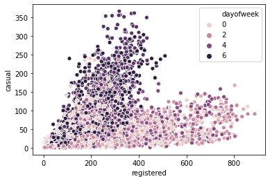
sns.scatterplot(data = df, x = 'registered', y = 'casual', hue = 'workingday')<matplotlib.axes._subplots.AxesSubplot at 0x265485e0>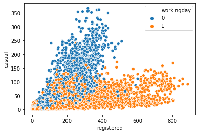
- 위 두 그래프를 통해 공공자전거 등록회원과 비등록회원의 차이가 유의미하게 나타났음을 확인할 수 있다.
- 등록회원(registered)의 경우, 일하는 날에 자전거를 많이 이용하며, 비등록회원(casual)은 주말에 자전거를 많이 이용하는 경향성을 보인다.
등록회원과 비등록회원 비교
sns.lineplot(data = df, x = 'hour', y = 'registered', hue = 'dayofweek')<matplotlib.axes._subplots.AxesSubplot at 0x26c6d220>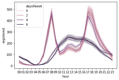
sns.lineplot(data = df, x = 'hour', y = 'casual', hue = 'workingday')<matplotlib.axes._subplots.AxesSubplot at 0x42aa610>
- 등록회원과 비등록회원에 대한 시간별 line graph를 각각 살펴보았다.
- 등록회원과 비등록회원 둘 다 평일과 주말에 각각 다른 그래프 형태를 보였다.
- 등록회원 / 평일: 출근 시간과 퇴근 시간에 주로 자전거를 이용한다.
- 등록회원 / 주말: 주로 점심시간과 저녁시간 사이에 자전거를 이용한다.
- 비등록회원 / 평일: 이용량이 거의 없으며, 오후 시간대에 미미하게 높은 이용률을 보인다.
- 비등록회원 / 주말: 주로 오후에 이용량이 급격히 증가하는 형태를 보인다.
for_plot = df.loc[df['dayofweek'] >= 5]
sns.pointplot(data = for_plot, x = 'hour', y = 'registered', hue = 'dayofweek')
<matplotlib.axes._subplots.AxesSubplot at 0xf3e8748>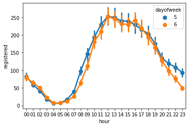
- 등록회원들의 주말 이용률만 따로 추출하여 살펴보자.
- 토요일 저녁보다 일요일 저녁의 사용량이 더 적게 나타난다.
- 일요일에는 다음 날 출근을 해야 한다는 부담감이 있기 때문에 이와 같은 결과가 나타난다고 볼 수 있다.
Data Preparation
- 데이터를 분석 모형에 넣기 위해 형태를 맞추는 작업을 진행한다.
- train / test 분리 -> row 분리
- 문제와 정답 분리 -> feature / label 분리 -> column 분리
- [연도, 월, 일, 시, 요일, 날씨]이(가) 이용객 수에 영향을 줄까?
- Generalization: A가 B에 영향을 줄까? -> A = feature, B = label
#column 분리 : 문제와 정답 분리
features = ['season', 'holiday', 'workingday', 'weather', 'temp',
            'atemp', 'humidity', 'windspeed', 'year', 'month',
            'day', 'hour', 'dayofweek']

label = 'count'#지도학습에서 맞히고자 하는 대상

#row 분리
train, test = df[0::2], df[1::2] #홀/짝 기준으로 공부용/시험용 분류
#reset_index
train, test = train.reset_index(), test.reset_index()

#공부용/시험용 문제정답 분리
X_train, y_train = train[features], train[label]
X_test, y_test = test[features], test[label]
Model Planning
- 지도학습은 2가지 시험 유형으로 나눌 수 있다.
- 숫자 맞히기
- Regress ~ 라는 수식어 사용 (Regression, Regressor ...)
- 회귀문제라고 부름
- 경우의 수 맞히기
- Classify ~ 라는 수식어 사용 (Classification, classifier ...)
- 분류문제라고 부름
- 숫자 맞히기
- 이 데이터셋의 경우, 숫자(수요량)를 맞히는 것이므로, 회귀 알고리즘을 사용한다.
Model Building
from sklearn.ensemble import RandomForestRegressor as rf #알고리즘 불러오기
model = rf()
model.fit(X_train, y_train) #model fitting (학습)
model.score(X_train, y_train)0.9920201431437241model.score(X_test, y_test)0.9206981367962218R-squared 이외에 회귀분석에서 자주 사용되는 평가지표 구성요소
- R : Root, 제곱근
- M : Mean, 평균
- S : Squared, 제곱
- L : Log, 로그
- P : Percentage, 퍼센트
- A : Absolute, 절대값
- E : Error, 오차
예시
- MAPE : 오차의 퍼센트에 절대값을 씌우고 평균
- MAE : 오차의 절대값의 평균
- MSE : 오차 제곱의 평균
- RMSE : 오차 제곱 평균의 제곱근
- RMSLE : 로그오차의 제곱을 평균에 대한 제곱근
import pandas as pd
for_plot = pd.DataFrame()
for_plot['tr_predict'] = model.predict(X_train)
for_plot['te_predict'] = model.predict(X_test)
for_plot['tr_actual'] = y_train
for_plot['te_actual'] = y_test
for_plot.head()| tr_predict | te_predict | tr_actual | te_actual | |
|---|---|---|---|---|
| 0 | 21.85 | 22.20 | 16 | 40 |
| 1 | 25.95 | 15.11 | 32 | 13 |
| 2 | 2.73 | 3.82 | 1 | 1 |
| 3 | 3.01 | 22.60 | 2 | 3 |
| 4 | 24.10 | 51.64 | 8 | 14 |
Training set의 회귀분석 결과
- R-squared가 거의 1에 수렴한다
import seaborn as sns
sns.scatterplot(data = for_plot, x = 'tr_predict', y = 'tr_actual')
<matplotlib.axes._subplots.AxesSubplot at 0x288daa78>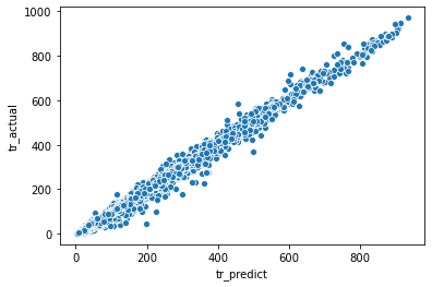
Test set의 회귀분석 결과
sns.scatterplot(data = for_plot, x = 'te_predict', y = 'te_actual')<matplotlib.axes._subplots.AxesSubplot at 0x288ad490>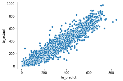
Feature Selection
- 유의미한 분석을 위해서는 여러 가지 column 중에서 알고리즘에 넣을 변수를 잘 선정하는 것이 중요하다.
- Feature Select 시에 활용하는 대표적인 방법들을 적용해 보며 중요한 변수들이 무엇인 지 확인해 볼 것이다.
Wrapper 방식
- feature의 조합에 따라 평가지표의 수치가 달라질 것이다.
- 따라서, 조합 별로 평가지표를 확인하고, 가장 좋은 평가지표를 선택한다.
def tt_split(features):
    label = 'count'
    train, test = df[0::2], df[1::2]
    train, test = train.reset_index(), test.reset_index()
    X_train, y_train = train[features], train[label]
    X_test, y_test = test[features], test[label]
    return X_train, y_train, X_test, y_test
sample_features = ['holiday', 'workingday', 'weather', 'temp',
'atemp', 'humidity', 'windspeed', 'year', 'month', 'hour', 'dayofweek']
X_train, y_train, X_test, y_test = tt_split(sample_features)
model = rf()
model.fit(X_train, y_train)
model.score(X_test, y_test)0.9247400117866152from sklearn.feature_selection import RFE
#Recursive Feature Elimination
rfe = RFE(estimator = model) #어떤 알고리즘을 이용하여 평가할까?
rfe.fit(X_train, y_train) #RFE 방식의 학습 진행 (어떤 feature가 중요한 지?)RFE(estimator=RandomForestRegressor())for_rfe = pd.DataFrame()
for_rfe['ranking'] = rfe.ranking_ #변수의 중요도 순서(랭킹, 순위)
for_rfe['features'] = sample_features
for_rfe = for_rfe.sort_values(by = 'ranking')
for_rfe #ranking이 1인 것들은 알고리즘에서 뺐을 때 성능이 크게 떨어진다고 해석 가능함
#ranking이 낮은 순위들은 알고리즘에서 뺐을 때 성능변화가 없거나 성능이 좋아진다고 판단| ranking | features | |
|---|---|---|
| 3 | 1 | temp |
| 4 | 1 | atemp |
| 7 | 1 | year |
| 9 | 1 | hour |
| 10 | 1 | dayofweek |
| 8 | 2 | month |
| 1 | 3 | workingday |
| 5 | 4 | humidity |
| 2 | 5 | weather |
| 6 | 6 | windspeed |
| 0 | 7 | holiday |
Embed 방식
- model 변수에 RandomForest를 사용한다.
- 이 방법을 통해 각 feature 별로 중요도를 파악할 수 있다.
fi = pd.DataFrame()
fi['importance'] = model.feature_importances_
fi['feature'] = sample_features
fi = fi.sort_values(by = 'importance', ascending = False)
fi| importance | feature | |
|---|---|---|
| 9 | 0.608508 | hour |
| 7 | 0.069298 | year |
| 4 | 0.068666 | atemp |
| 8 | 0.055296 | month |
| 1 | 0.050644 | workingday |
| 10 | 0.047750 | dayofweek |
| 3 | 0.043840 | temp |
| 5 | 0.027434 | humidity |
| 2 | 0.016500 | weather |
| 6 | 0.010107 | windspeed |
| 0 | 0.001957 | holiday |
import matplotlib.pyplot as plt
sns.barplot(data = fi, x = 'importance', y = 'feature')
plt.title("Importance of Features")
Text(0.5, 1.0, 'Importance of Features')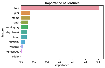
'Python Programming > Notes' 카테고리의 다른 글
| Web_Crawler(3)_HTML (0) | 2021.03.22 |
|---|---|
| 금융데이터 다루기 - 패키지 설치와 Plotting (0) | 2021.03.18 |
| Web Crawler(2) - XML 뉴스 정보 가져오기 (0) | 2021.02.21 |
| Web Crawler(1) - JSON (0) | 2021.02.14 |


